What is the DataLogger and UserInsight?
The DataLogger feature of RSIGuard records continuous
ergonomic data such as how much time you spend on the mouse and keyboard, how often you take suggested breaks, and
other ways that you interact with the computer that indicate your risk for
injury. RSIGuard typically stores this data on
your hard drive (or a network drive if configured for your company).
The exclusive purpose of this data is to help you, your doctor or other
medical professional, and your organization to determine risk factors that
may predispose you to developing discomfort and/or to help you correct
problems that may reduce any discomfort you already experience.
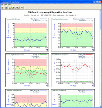
To view your own data, go to the Tools menu of RSIGuard, select DataLogger Usage Statistics and
then View Longterm Usage Statistics. This will launch the UserInsight
viewer, and you will see a window like this one:
|
 |
UserInsight
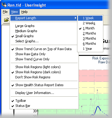
View Options
|
From the View menu, you can specify what data you wish to view
and how you want to see it:
- Report Length - Select the amount of data you wish to view at a
time (from 1 week to 1 year). To change the range of the data to earlier
or later, see Scrolling Through Data.
- Graph Size/Selection - Select the desired size of graphs (large, medium or
small). Use Select Graphs to select which graphs to show/hide.
- Data Representation - Select whether you wish to see the raw data, a smoothed
version of the graph that shows data trends, or a smoothed trend graph superimposed on
top of the raw data. Raw data shows the actual values recorded each day.
Trend data
shows an averaged curve that indicates data trends (e.g. increasing,
decreasing). To adjust the degree to which trend data is smoothed (averaged), see Adjusting
Trend Averaging.
- Risk regions coloring - Select if you want UserInsight to show
red/yellow/green regions to indicate data that is of more concern
(red/yellow) or less concern (green).
- Health Status Reports Dates - Select whether you wish to see markings that show dates
on which you filed Health Status Reports. Double-clicking on these marks will show
you the reports that were filed using the Health Status Reports Tool.
- Display User Information - Shows additional user information
(e.g. organization name, department).
- Toolbar, Status Bar - Show/hide the toolbar & status bar.
|
 |
Scrolling Through Data
By default, UserInsight shows you your most recent data. But you can use the
Left and Right arrow keys to scroll back to view older data. Press Ctrl+Left to
scroll to the start of your data, or Ctrl+Right to scroll to the most recent
data again.
| Alternately, you can use the scroll buttons on the Toolbar. |
 |
Adjusting Trend Averaging
|
UserInsight has an option to show a "trend" graph.
Trend graphs are averaged data that let you see trends in the underlying data.
For example, if the hours you spend on the computer are, on average, increasing,
but you still work different lengths of time each day, the trend graph will show
the increase even if the underlying data is noisily bouncing up and down.
If you have chosen to show trend data ( in the View menu), you can
select to what degree the data is averaged/ smoothed by pressing Ctrl Up-Arrow and Ctrl
Down-Arrow. The more the data is smoothed, the more the resulting curve will
show trends. Less smoothing shows a curve closer to the raw data.
|
|
 |
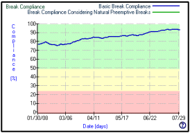 |
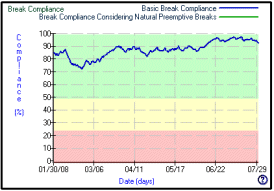
| The above two graphs correspond to the same data.
However, the data on the left is less smoothed. The upward trend is
clearer on the graph on the right, and shows that break compliance
has, on average, increased from about 78% to 92% over the 6 months
that are shown. |
Viewing Individual Data Points
If you wish to see the precise value of a statistic on a
particular day, just move the mouse over that graph and the
statistic will be displayed.
Printing Reports
After selecting the viewing options you want, you can print UserInsight graphs. Click on File and select Print (or Print
Preview). You can also click on the Printer icon in the toolbar
or press "Ctrl P". The print window will allow you to
either print selected pages of the reports or the entire report.
Exporting DataLogger Data
You can export you DataLogger data to CSV format which is
directly importable into any database or spreadsheet program. To do so, click on
the File menu and select Export Data...
What do the Graphs Show?
Each graph has a context help button ( )
in the bottom right corner. Position the mouse over the button and a help
window will describe what that graph tells you. )
in the bottom right corner. Position the mouse over the button and a help
window will describe what that graph tells you. |
 |
Detailed technical descriptions of DataLogger data are
available in a document call the DataLogger Detailed Analysis.
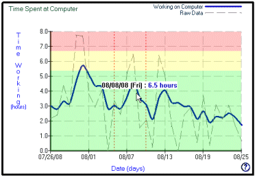
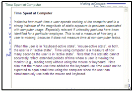
- Time Spent at Computer -- Shows how many hours during
your workday are spent at the computer and away from the
computer
- Hours using Keyboard & Mouse -- Shows how many hours
are spent using the keyboard and the mouse individually.
Note that the sum of these two numbers do not equal time
spent at the computer because you often use the keyboard
and mouse at the same time.
- Strain from Using Keyboard -- Based on a study of strain
associated with different keyboard actions (e.g. pressing
'A' vs. 'G', pressing 'P' vs. 'Ctrl P', etc.), this
statistic estimates your exposure to muscle strain. This
measurement gives a relative measure of strain exposure
between your exposure at various different points in time
or between various different people. However, there are
no established thresholds of safe or unsafe exposure.
- Strain from Using Mouse -- Based on a study of strain
associated with different mouse actions (e.g. single
click vs. double click, drag and drop operations, etc.),
this statistic estimates your exposure to muscle strain.
This measurement gives a relative measure of strain
exposure between your exposure at various different
points in time or between various different people.
However, there are no established thresholds of safe or
unsafe exposure.
- Start & End Time at Computer -- Shows the starting
and ending times of your daily computer use.
- BreakTimer Breaks Taken & Skipped -- Shows how many
BreakTimer-suggested breaks you took and how many you
skipped.
- Microbreaks Taken & Skipped -- Shows how many
Microbreaks you took and how many you ignored.
- Natural Breaks Taken -- Shows how many natural rests you
take while using the computer. Four different lengths of
natural rest breaks are measured and displayed.
- Time in BreakTimer Breaks -- Shows how many minutes you
spend in BreakTimer-suggested breaks.
- Minutes Breaks Postponed -- Shows how many minutes you
put off taking BreakTimer-suggested breaks via the
"Postpone Break" buttons.
- Stretches Viewed -- Shows how many stretches were
displayed to you during BreakTimer-suggested breaks.
- Keypress Force Estimate -- Shows an estimate of how hard
you struck keys during the day based on a model that
measures force by watching how long keys are held down.
- Keypresses -- Shows how many keypresses you made during
each day.
- Mouse Movement -- Shows an estimate of how much mouse
movement you performed each day.
- Mouse Clicks -- Shows how many mouse clicks you perform
each day.
- AutoClicks -- Shows how many mouse clicks you avoided
needing to do by using AutoClick.
- Manual & KeyControl Drag & Drops -- Shows how
many times you performed drag & drop operations using
the mouse, and how many times you performed drag &
drop operations using KeyControl
- Switches between Keyboard & Mouse -- Shows how many
times you switched from (i.e. moved your arm between) the
mouse to the keyboard or vice-versa.
- Typing Corrections -- Shows how many times you pressed
sequences of Delete or Back-space keys. These can be an indication of how many errors a user is making
(assuming the user's job is not, for example, copy
editing).
- Words Typed -- Shows how many words you typed while using
the computer.
- Keystroke frequency by key -- Shows how much you use each
key on the keyboard. Usage is expressed as a percentage
of total keypressing.
- Keystrike pressure by key -- Shows an estimate of how
hard you strike each key on the keyboard based on a model
that measure the length of time you hold each key down.